Wolf
AI is here, time to obey our robot overlords!
Uni Watch Power Rankings - NFL's best, worst uniforms
1. Pittsburgh Steelers (+3)
View uniforms here
Aside from the switch from block numbers to italics (which many fans still gripe about, although it's been nearly 20 years now and we should all just get over it already), the Steelers have stayed the course. They still have their logo on only one side of the helmet, they still don't use helmet numbers during the preseason (you have to earn them by making the final roster cut), they still have that instantly recognizable sleeve striping (the Rolling Stones are even using it to promote their show at Heinz Field), and their gold pants still work equally well with either of their jerseys. And while some folks can't stand the bumblebee throwbacks, that design is actually a big hit here at Uni Watch HQ and helps vault the Steelers into the top spot in this year's Power Rankings. First rate.

2. Oakland Raiders (+2)
View uniforms here
Just suit up, baby. Whether you're talking about music, movies, food or uniform design, the classics are classic for a reason, and it doesn't get much more classic than the Raiders' elemental silver and black. No alternates, no throwbacks, no Nike collar, no nonsense. True, they haven't fared very well on the field in recent years, but think of it this way: If you have to lose a bunch of games, you may as well look great while you're doing it.

3. Green Bay Packers (-1)
View uniforms here
Still the perfect autumnal color scheme for a fall sport. The Pack might have ended up one or even two spots higher in this year's rankings if not for some lingering ambiguity regarding their uniform set: They're scrapping their Acme Packers throwbacks and replacing them with a new throwback uni. No word yet on what that design will be or when it will be unveiled, so for now Green Bay's grade has to be considered a bit incomplete.

4. Chicago Bears (-3)
View uniforms here
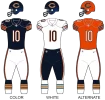
The color scheme is as effective as ever, the matching stripes on the sleeves and socks are still the envy of most other teams, the unique number font is still instantly recognizable, and the Monsters of the Midway throwback has become a nice annual ritual. So why have the Bears dropped three spots in this year's rankings? Two reasons: First, the helmet logo is starting to feel a bit dated. And all the old-school trappings don't work well with Nike's Flywire collar. Several other teams -- including all three of the ones ranked above the Bears on this year's list -- have opted not to use that collar style. The Bears would be smart to do likewise.

5. San Diego Chargers (+3)
View uniforms here
Is there another team-specific graphic in all of sports that has worked so well, for so long, and in so many applications as the Lightning Bolts' lightning bolts? Whether on the helmet, the jersey, or the pants, the bolts look as cool today as they did a half-century ago. The powder-blue throwback doesn't hurt, either. Now if the Chargers would just put the uni numbers back on the helmets like in the old days -- that would definitely move them up another spot or two in the rankings.

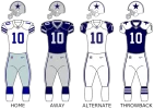
6. Dallas Cowboys (+1)
View uniforms here
I know, I know -- the various shades of blue and silver don't match, the black outlines on the blue sleeve stripes are unnecessary, the blue-silver pants are now a lot more blue than silver. But these quirks have now been around for so long that they've become baked into the Cowboys' brand. And the helmet remains one of the NFL's all-time best.

7. Buffalo Bills (-2)
View uniforms here
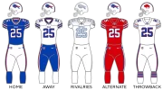
Generally speaking, the Bills are a very good-looking team -- nice color scheme, excellent helmet, solid jersey and pants, bonus points for the striped socks -- but they've been docked a notch for going mono-blue for last December's game against the Packers. It was the first solid-colored game with the team's current uniform set, and let's hope it's also the last.

8. Philadelphia Eagles (+2)
View uniforms here
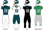
It's hard to judge the Eagles on what they wore last year, because a Nike manufacturing glitch left them without their signature midnight green jerseys and pants until more than halfway through the season, forcing the team to wear more white and black components than usual. Assuming Nike has its act together this time around, the Eagles should return to being one of the league's better-looking teams. (Although they'd look even better if they traded in the midnight green for kelly, which many fans have been requesting for years, and if they ditched the black alternates.)

9. Indianapolis Colts (+4)
View uniforms here
From Johnny U to Peyton Manning to Andrew Luck, the Colts' old-school look is tailor-made for a quarterback standing tall in the pocket. Not the league's most dynamic design, and it would be nice if the shoulder stripes could wrap around a bit farther, but still a uniform set that has stood the test of time.

10. Kansas City Chiefs (-1)
View uniforms here
Much like the Bills, the Chiefs are a good-looking team that's lost points by going mono. Their red pants -- arguably the single best uniform component in the entire league when paired with the white jersey -- should never be used to create the blood-clot look (which the team has now experimented with for two consecutive seasons). Come on, people, you know Lamar Hunt would want you to use the red pants for good, not evil.
1. Pittsburgh Steelers (+3)
View uniforms here
Aside from the switch from block numbers to italics (which many fans still gripe about, although it's been nearly 20 years now and we should all just get over it already), the Steelers have stayed the course. They still have their logo on only one side of the helmet, they still don't use helmet numbers during the preseason (you have to earn them by making the final roster cut), they still have that instantly recognizable sleeve striping (the Rolling Stones are even using it to promote their show at Heinz Field), and their gold pants still work equally well with either of their jerseys. And while some folks can't stand the bumblebee throwbacks, that design is actually a big hit here at Uni Watch HQ and helps vault the Steelers into the top spot in this year's Power Rankings. First rate.
2. Oakland Raiders (+2)
View uniforms here
Just suit up, baby. Whether you're talking about music, movies, food or uniform design, the classics are classic for a reason, and it doesn't get much more classic than the Raiders' elemental silver and black. No alternates, no throwbacks, no Nike collar, no nonsense. True, they haven't fared very well on the field in recent years, but think of it this way: If you have to lose a bunch of games, you may as well look great while you're doing it.
3. Green Bay Packers (-1)
View uniforms here
Still the perfect autumnal color scheme for a fall sport. The Pack might have ended up one or even two spots higher in this year's rankings if not for some lingering ambiguity regarding their uniform set: They're scrapping their Acme Packers throwbacks and replacing them with a new throwback uni. No word yet on what that design will be or when it will be unveiled, so for now Green Bay's grade has to be considered a bit incomplete.
4. Chicago Bears (-3)
View uniforms here
The color scheme is as effective as ever, the matching stripes on the sleeves and socks are still the envy of most other teams, the unique number font is still instantly recognizable, and the Monsters of the Midway throwback has become a nice annual ritual. So why have the Bears dropped three spots in this year's rankings? Two reasons: First, the helmet logo is starting to feel a bit dated. And all the old-school trappings don't work well with Nike's Flywire collar. Several other teams -- including all three of the ones ranked above the Bears on this year's list -- have opted not to use that collar style. The Bears would be smart to do likewise.
5. San Diego Chargers (+3)
View uniforms here
Is there another team-specific graphic in all of sports that has worked so well, for so long, and in so many applications as the Lightning Bolts' lightning bolts? Whether on the helmet, the jersey, or the pants, the bolts look as cool today as they did a half-century ago. The powder-blue throwback doesn't hurt, either. Now if the Chargers would just put the uni numbers back on the helmets like in the old days -- that would definitely move them up another spot or two in the rankings.
6. Dallas Cowboys (+1)
View uniforms here
I know, I know -- the various shades of blue and silver don't match, the black outlines on the blue sleeve stripes are unnecessary, the blue-silver pants are now a lot more blue than silver. But these quirks have now been around for so long that they've become baked into the Cowboys' brand. And the helmet remains one of the NFL's all-time best.
7. Buffalo Bills (-2)
View uniforms here
Generally speaking, the Bills are a very good-looking team -- nice color scheme, excellent helmet, solid jersey and pants, bonus points for the striped socks -- but they've been docked a notch for going mono-blue for last December's game against the Packers. It was the first solid-colored game with the team's current uniform set, and let's hope it's also the last.
8. Philadelphia Eagles (+2)
View uniforms here
It's hard to judge the Eagles on what they wore last year, because a Nike manufacturing glitch left them without their signature midnight green jerseys and pants until more than halfway through the season, forcing the team to wear more white and black components than usual. Assuming Nike has its act together this time around, the Eagles should return to being one of the league's better-looking teams. (Although they'd look even better if they traded in the midnight green for kelly, which many fans have been requesting for years, and if they ditched the black alternates.)
9. Indianapolis Colts (+4)
View uniforms here
From Johnny U to Peyton Manning to Andrew Luck, the Colts' old-school look is tailor-made for a quarterback standing tall in the pocket. Not the league's most dynamic design, and it would be nice if the shoulder stripes could wrap around a bit farther, but still a uniform set that has stood the test of time.
10. Kansas City Chiefs (-1)
View uniforms here
Much like the Bills, the Chiefs are a good-looking team that's lost points by going mono. Their red pants -- arguably the single best uniform component in the entire league when paired with the white jersey -- should never be used to create the blood-clot look (which the team has now experimented with for two consecutive seasons). Come on, people, you know Lamar Hunt would want you to use the red pants for good, not evil.